Friday, 17 March 2017
Sound
We have recently changed the music to a ticking soundtrack that we found on Youtube, it was copyright and loyalty free from the Youtube site original music store, it's called the haunting clock. We used this as it fits with our original theme of time running out, and a ticking clock is in most of our shots, you can still see it if you look closely but it's not as overwhelmingly present as it would have been. In our opening scene, we also have other uses of sound like diegetic (like what was in the shots) and Non-diegetic which includes voice over, music (which I've talked about) and a low pitched boom sound played behind the four shots of the dead character, and played when the title comes up. The boom is to catch the viewers attention to important parts of the opening scene, this links to later events in the movie like the death of a character. The voice-over sets the scene for the protagonist and it is there to get the viewer thinking about who they could be and what they have to do with all of this. We have also got the diegetic sound of people at the party talking and giving hints as to what class they belong to (the upper class) and puns to the later death of a character they have ties with.

Thursday, 9 March 2017
Written feedback by a media student
Claudia Wingrove
Feedback:
Pros:
- The background music running on in the background was really affective, it created the right atmosphere and drew me into the film.
- the opening shots were very steady and ran off one another, which made everything to make sense.
- There was a clear semantic field of death
- The cutting between each of the scenes was clear and ran smoothly.
- the voice over was full of emotion and help portray the appropriate feelings
- you made it hard to know which one of the guys would die because they both spoke about death, got me trying to guess!
Pos Criticism:
- Make sure that the flash of the hand especially is made a second longer this will help the audience to hold the image longer in their mind as it was quite quick
- The beginning did look a little bit like a trailer, so maybe make it shorter... but keep some of it in.
- Wasn't quite clear who the person who spoke over the shots was... a clairvoyant? a friend? the killer? although this may be showed later on then.
My Response To The Positive Criticism:
- It wasn't supposed to be clear who was in the voice over was, its supposed to make the audience think and make them confused, so i'm happy that it worked.
- The beginning is there just to set the seen and crate and atmosphere.
- We looked into changing the flashed of the still images however when we looked at it being longer it gave too much away and we felt like it didn't fit into the opening right.
Ident


I designed this ident as Morgan chose the font and I wanted to go with a pixel theme like what is displayed in the letters. I wanted to give an effect where it looked like the pixels where fading away to give an iconic modern feel to it. I also kept it black and white to keep it simple and memorable. The name Loragan pictures came from a mixture of a Morgan's and my name; we added 'pictures' to pair with the name as the R's matched and made the title look symmetrical.
Rough Cuts
Rough Cut 2
The challenges we faced here was trying to get the stabiliser to stabilise some of the shot as some of them where recorded by hand. In this we added in some more shots to make the video longer, we would often make cuts between to similar shots and put another in the middle to add diversity and link two shots together. For instance the shot of the fire that then cuts to the cards and then back to the fire implies that they either link or that the two processes, like the fire being burnt and the cards being laid, are going on at the same time. The card shots implies that something bad is going to happen and the fire represents part of the destruction or how a situation may have burst into flames.
First showing of rough cut and feedback
Morgan did some editing at home and she showed her mum and we made some changes from this. For instance we changed the original shot of Corey dying as it was weak and as we didn't have any fake blood at the time and it didn't look very effective, or even look like he'd died. We made sure to make changes of this so we re-filmed it. Also her mum talked about the music and how it would be better if we added ticking clock noises in the background so that it looked like his time was running out. She also recommended that we add more/ better shots of the fortune telling cards so we re-filmed it and added it in.
Tuesday, 7 March 2017
Rough Cuts
Rough Cut 1
This is our first rough cut, in this we realised that we realised that we did not have enough shots for the film so we went out to shoot some more atmospheric shots. In this edit we decided to fiddle around with the leave colour tool for the wine glass to give a more spooky feel to the opening. Also we wanted to link the red colour in the wine class to the later shots of the dead body with the blood as part of a foreshadowing of the death effect. The shot of the wine glass is also there to give a hint of what way the character may have died. In this we were also choosing on what sound we wanted, at fist we decided on a murder mystery typed theme song, however we finally went to a spooky clock ticking theme song as to link to our original idea of having a ticking clock prominent in our opening scene. the idea of the clock it to link to the idea of time running out and death. Later on in the movie time is going to become more of an big part as all the characters cant leave the room until they have worked out who the murderer is.
Wednesday, 1 March 2017
The final title
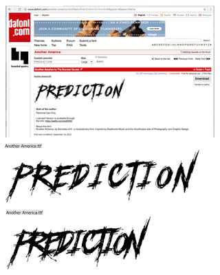
We changed our title to prediction as we thought that our audience may get confused by Seite as its a Spanish word and our movie does not have anything to do with Spain. We chose this font as its sharp, crisp edges made it very prominent and memorable, When I look at the edges the sharpness makes me think of a knife, and this could connote danger to the viewer if they see that as well. The font looks like it's almost been painted on with blood this links to our murder mystery thriller genre. The contrast between the relatively smooth flow of the editing and ticking of the clock, with the previous soft curvy font compared to the jagged title font, makes it even more prominent and impressionable. The title also gives off a horror feel making the opening scene even more spooky.
Subscribe to:
Posts (Atom)